Wednesday, 3 June 2009
animation.
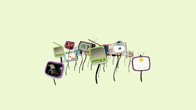
This is the animation section in the music video for l-Mo. i think its very flat and static, definitely needs more work to bring it up to the standard i initially envisaged.
WHO'S DOING WHAT TO WHO?.
The rough working edit of the video from last week, - the animation and transitions both need more work, and i want to composite footage onto the TV screens as the video progresses. This will definitely be in stationary shots, and maybe in very small snippets of shots with the dolly - as there are no distinguishing areas to track on the tv's, motion tracking is difficult, and it would be the case of editing frame by frame which is v time consuming.
Wednesday, 20 May 2009
ART DIRECTION & CURRENT SITUATION.
For my friday shoot i want to make the most of my studio time. Ive already outlined the general plan for the morning (*), but i think it will be beneficial to note down some specifics.
The key shots i need to get are the frontal views of each band member in between the props, which consist of 4 televisions, amplifiers, and an exaggerated web of cables/leads sitting either side, performing for the whole song duration. I'm providing two opportunities post-production with this setup -
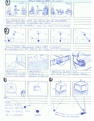
1. The flat/frontal angle will allow the animations to be composited concisely within each screen, and a flat angle to scale into them head-on. (see 1.)
2. The second option caters for a more ambitious approach within post-production; I've also booked out the track and dolly to get a fluid pan across the same setup (see 2). The smoothness of this shot will allow me to motion track the position of the television screen in relation to the camera more accurately, however this is a very time consuming process and may not feasible within my time plan, but we will see.
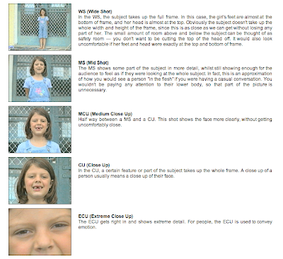
For the remainder, im going to experiment with various shot frames. The positive feedback i got in the last group crit from the rushes i showed was centred around the variety of shot angle (illustrated below) and some concise cuts between them, so i am going to carry this forward.
The key shots i need to get are the frontal views of each band member in between the props, which consist of 4 televisions, amplifiers, and an exaggerated web of cables/leads sitting either side, performing for the whole song duration. I'm providing two opportunities post-production with this setup -

1. The flat/frontal angle will allow the animations to be composited concisely within each screen, and a flat angle to scale into them head-on. (see 1.)
2. The second option caters for a more ambitious approach within post-production; I've also booked out the track and dolly to get a fluid pan across the same setup (see 2). The smoothness of this shot will allow me to motion track the position of the television screen in relation to the camera more accurately, however this is a very time consuming process and may not feasible within my time plan, but we will see.
For the remainder, im going to experiment with various shot frames. The positive feedback i got in the last group crit from the rushes i showed was centred around the variety of shot angle (illustrated below) and some concise cuts between them, so i am going to carry this forward.

MBLOOKS.
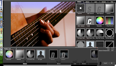
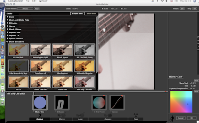
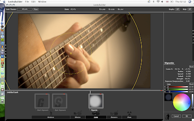
Using magic bullet looks has provided a really insightful taster of high-end grading software, as it is so easy to use. There are a vast range of post-production options available, laid out in a very visual/accessible way, and thus a temptation to dabble with everything is hard to resist. As is often the case with software, using it subtley and intelligently always creates the most effective results, so it will take some time to become accustomed. However i've been playing around with it today, hopefully i'll have found a handful of combinations that may work for grading my final edit more professionally.


CORNER-PIN.
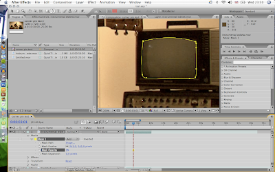
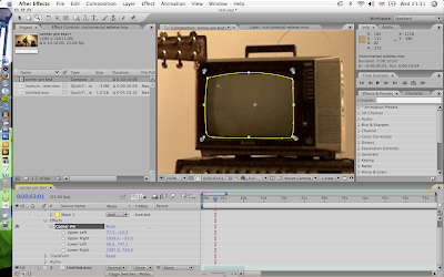
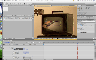
A more efficient method of sectioning within the composition is to use CORNER-PIN rather than masking off an area, as you can create a sense of depth by re-arranging the corner points.


animation content.
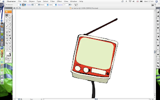
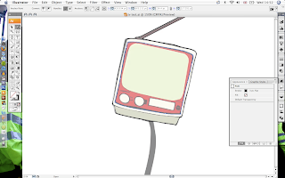
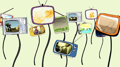
I want to make a series of televisions similar in style of those in the short film i spoke about in my animation post. It will be challenging to produce images that are both authentic and of decent enough quality given my immediate limited knowledge of AI, but i think im progressing slowly.
I spoke with one of the technicians, mike, at length today regarding the importance of setting up the content in AE once it has been transferred from AI. We discussed the pixelation of the televisions in the animation example that he showed me previously (below), and he gave some really useful general pointers.
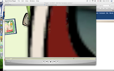
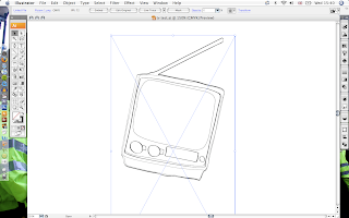
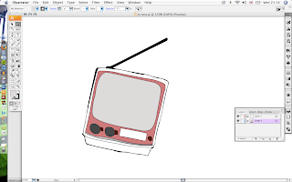
Below is a rough tracing exercise over one of the televisions from that animation, and i hope to feedback asap on some short tests to follow this up.
I spoke with one of the technicians, mike, at length today regarding the importance of setting up the content in AE once it has been transferred from AI. We discussed the pixelation of the televisions in the animation example that he showed me previously (below), and he gave some really useful general pointers.

Below is a rough tracing exercise over one of the televisions from that animation, and i hope to feedback asap on some short tests to follow this up.


studio shoot details.
I've managed to book out the studio theatre for a 5 hour slot on friday morning, meeting the band at 8.45am to load out their van. I expect to have the band and props set-up within the hour and the recording equipment good to go for a 10 O'clock start, which will give me 3 hours or so to get my footage down - factoring in the time it will take to pack up for 2pm.
I want to create a fairly organic/warm tone with 3 red-tops, 1 keno, and maybe 1 spot in the lighting setup, and have enlisted some help from tom and jack with the dolly. This should hopefully cover my bases enough to get down the shots i want, and set me up for a bank holiday weekend of editing on Final Cut and After Effects.
I want to create a fairly organic/warm tone with 3 red-tops, 1 keno, and maybe 1 spot in the lighting setup, and have enlisted some help from tom and jack with the dolly. This should hopefully cover my bases enough to get down the shots i want, and set me up for a bank holiday weekend of editing on Final Cut and After Effects.
ILLUSTRATOR.
AI is something i should have got to grips with ages ago. Since learning of its (and also Photoshop's) compatibility with After Effects, ive taken this off the back burner and started to try and understand the technicalities of working them both in tandem.
I got some tutorials off the technicians that suggested some very basic exercises with the pen tool (below). I think that the vector format will be useful for the animations i have in mind, as i can scale the illustrator files to any extreme and not worry about them pixelating. I hope to create the contents of my animations within AI and bring them to life in After Effects.
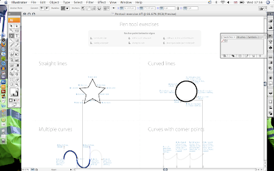
I got some tutorials off the technicians that suggested some very basic exercises with the pen tool (below). I think that the vector format will be useful for the animations i have in mind, as i can scale the illustrator files to any extreme and not worry about them pixelating. I hope to create the contents of my animations within AI and bring them to life in After Effects.

Tuesday, 19 May 2009
7 NATION ARMY.
This was directed by Alex and Martin for 'seven nation army' by the white stripes in 2003, a seemingly continuous shot which creates a warped/dis-orientating perspective that is difficult to remove yourself from. This would be a great transition between the animation and footage but will probably be really difficult, im going to look into it anyway.
ANIMATION.
After the response i got from the final crit regarding animation, i felt more re-assured about incorporating some within the footage. I explained how i have started to build up a basic knowledge of After Effects, and it was suggested that i explore this further. I was penalized for concentrating my learning heavily within effects in the previous project, so i wanted to experiment with a different style for this one.
I like the idea of extending the television screens from the footage within the animation, which would link the two perspectives together nicely. Aside to this would be the underlying connotations that televisions have with the title - who's doing what to who? - and how many people would probably not be informed of current affairs if wasn't for their TV.
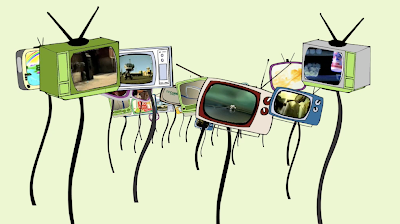
I discussed what i was trying to achieve and was shown a video by a 2nd year graphics student with a similar content, here's some screen grabs-


Monday, 18 May 2009
dolly.
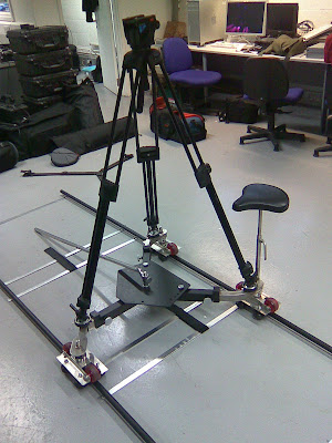
I spent a short time this morning learning how to set up the track and dolly. Using them on friday with the full band will provide some fluid movement in the shots, which i think could work nicely with the hand-held footage. It may work it may not, but at least i now have the choice to include it in the final edit.
Sunday, 17 May 2009
FINAL CREET.
I wanted to address the animation content before the crit, as i wasnt sure which angle to take with it. Whether to try and delve into the nature of the song and reflect the connotation of what is being said, or to run with a visual that would not necessarily consider this.
After going over the song it was fair to say the response agreed with the quiet voice in my mind of the lyrics being pretty weak, and not to explore them too heavily. It was interesting that sophie mac said with music videos the context of the visuals isn't always necessarily too important, which goes against the principles she has within all of design. But i was re-assured with this that i dont have to justify the visual too much, and thus have more scope/room to play with the content.
It was also suggested to try and make the set more imposing, i.e. using large amps, more televisions, and lots of cables, think about the visual difference between the footage and animations, and to definitely try and do some match-moving, even for a short time.
Seminar sequence.
rushes.
Some edits from tuesday - i cant quite work out why the audio goes out of sync on the chorus edit? It's perfectly fine in final cut, but as soon as it exports chooses to go well drastically out of sync, itll be some schoolboy error on my part no doubt. This is a good sort of practice run though. For this coming friday the whole band have finally agreed to come in and film, and as its in the lecture theatre this time, will have much more flexibility and control over lighting with the bigger space.
Obviously theres problems with this. It was difficult to light in a fairly tight room, and i found that i spent half the time trying to hide the stuff in the background. But it was good to get the camera in hand which is something im new to.
Im hopefully getting taught how to set the track up tomorrow morning which should create some nice and fluid horizontal pans - i think this will make motion tracking a little easier if i want to mask animations within moving shots.
Wednesday, 13 May 2009
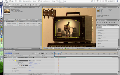
Masking.
This was just a quick masking tester from an old photograph to show how precisely you can mask off different layers within a composition. This would be a way of compositing animation within a static front shot, but I could also green/blue screen the specific areas, i.e. the television, and key them out in the same way. However if i want to include moving sweeps with the televisions in shot, i will have to motion track the television screens in such a way. I touched on this with my last brief - it will be great if i could incorporate this, even if its only a small section, into the final edit.
TVs.
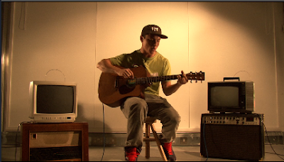
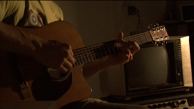
I need more than two though. I think a large, somewhat overwhelming, quantity will be important, although this may create an unmanageable workload as i would have to motion track each screen. A static, head-on setup would be more realistic however. I will have to pin-point this in a storyboard beforehand.
HiFi.
Some screen grabs from the L-Mo gig at hifi last week. I've uploaded the footage of the video song, 'who's doing what to who?' to view also.
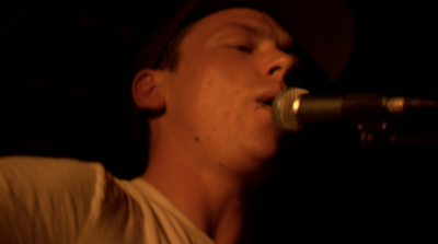
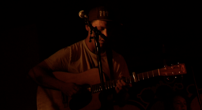
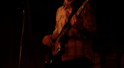
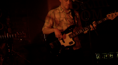
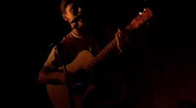
http://vimeo.com/4758279


http://vimeo.com/4758279
CREET.
My crit helped to focus the thinking behind the video in terms of ideas and concepts. It was generally suggested to lose the mish-mash of different techniques, such as tilt-shift, and instead run with the idea of a television screen set-up with studio shots of the band and some appropriate animation.
I liked the idea of accentuating this setup with an abundance of leads, wires and chords in conjunction with the full band, and using such details within quick fills or build-ups in the video.
I liked the idea of accentuating this setup with an abundance of leads, wires and chords in conjunction with the full band, and using such details within quick fills or build-ups in the video.
Wednesday, 29 April 2009
Initial Ideas.
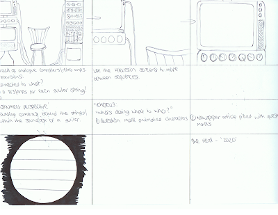
This is a quick mockup of some concepts within the video. We discussed constructing a setup of various media including television screens, amps, monitors, etc, which would sit either side of the band or an individual. I think the television screens would be useful to composite animation within the footage, and like the idea of decorating the props heavily with colourful wires/cables etc.
ANIMALS.
This is a music video i came across a while back by Kristofer Ström for Minilogue, an electronica duo from Sweden. I think the characters are a really effective way of accompanying a light-hearted tune, even though the music in this instance is fairly moody techno. Compositing the animation within the footage is very appealling, although match-moving an entire video on my own is not very realistic within the time scale, maybe i could do it within a small section. I think that would definitely show development from my last project.
27/3/09
I met up with Luke in the pub and we just spent afew hours talking over general stuff about the band and some filming possibilities. I explained to him the animations i had made for the YCN, and a couple of things i was looking to build on from that, such as motion tracking animation and Tilt-Shift lens filter effects.
Druskq.
Tilt-Shift.
Druskq.
Tilt-Shift.
Tuesday, 28 April 2009
Friday, 27 March 2009
Subscribe to:
Posts (Atom)


